


The DTF printing technology has significantly changed the custom apparel market by providing distinct and colorful prints. However, achieving brilliance with DTF printing consistently requires a proper understanding of the direct-to-film printing processes and techniques. In this article, we outline some requirements that can significantly influence the vibrancy of the DTF prints. If you refine these aspects, like reproduction materials, printer parameters, and machinery maintenance, you will achieve optimal results by yielding beautiful prints that add color. These points help novice and seasoned practitioners develop their DTF printing techniques, so let’s get into it.
How Can I Optimize the Color Settings of My DTF Printer?

Adjust the color settings of the DTF printer on-screen and uniformly adjust settings to ensure the final print matches the expectations and that the DTF printer is calibrated correctly. More so, the color ICC profiles of the printer and inks used as they calibrate the output to the machine according to the profile provided should be applied. Besides that, change the color balance and saturation options while printing so that you can control the degree of printing of the colors. You can get the desired color settings with consistent test printing and minor adjustments.
Understanding the Role of Color Profiles in DTF Printing
In DTF printing, color profiles can be the bridge connecting your vision to the colors printed on the clothing. These profiles, called ICC profiles, are vital since they explain how a color will be produced on the printer with available inks and media. The ICC profiles prevent the likelihood of color shifting or replication errors by remapping a digital design’s color spaces to those of a printing machine. They do it by enhancing color matching, reducing the number of unintended shifts, and many more, enhancing the output to be visually appealing. Finally, proper color profiles are critical for meeting expectations so that the result would be professional and of high quality in one’s direct-to-film projects, as color is practically all that matters.
Choosing the Right Color Mode for DTF Printing
It is crucial to highlight the difference between RGB and CMYK regarding color space selection when printing with DTF technology. The RGB color schema is an additive color space that is not suitable for the printing process. It’s specifically used for liquid crystal displays. The CMYK schema is the most notable and widely adopted color space for the printing industry because physical prints are created by combining elements of color ink. Consequently, the best practice to avert this problem when attempting to print them is to convert all of the designs from the RGB color mode to CMYK, which enhances the quality of the DTF prints while closely resembling the original designs.
Adjusting Ink Density for More Vibrant Prints
Adjusting ink density is an essential procedure in enhancing DTF print quality. Ink density means the refined concentration of ink on the fabric and, therefore, the resultant print’s tonal depth and color strength. If deeper prints are desired, set the ink limit in the printer fitting to allow enough flow but not enough to flood the substrate. This calls for careful adjustment of the ink quantity of the fabric used in direct-to-film printing. Trial prints and calibration devices should help select ink density settings that enhance the color and reproduce the image as close as possible to the designer’s intent.
What Are Effective Ways to Enhance DTF Ink Quality?

The Importance of Using High-Quality DTF Ink
The print result is mainly achieved by high-quality DTF ink. It guarantees vibrant colors that are uniform, and last long, which means they will not quickly erode with time or wear out, so your prints can get bright. Quality inks are usually designed to have good adhesion and elasticity, which is essential while printing on materials prone to stretching and movement. Likewise, suitable DTF inks are usually made of refined pigments that are less likely to cause clogging or damage the printer head, producing sharper images and smoother color gradients. Lastly, the use of high-quality DTF inks helps to lessen DTF printing-related maintenance problems, extending the existence of the printing device, which also guarantees smooth operations in the printing process.
Maintaining White Ink Settings for Consistent Results
Maintaining white ink sets is crucial for every customer to obtain a uniform and qualitatively good key in DTF printing. Reconstruct the white ink device at regular intervals for different fabric start of ink density suitable as required. This means adjusting the ink feed and print head height so that the white ink layer’s thickness is optimal and correct enough not to overwhelm the accuracy and appearance of the color. The white ink should be mixed regularly to avoid the white pigment’s granules settling and causing blockages. Thus, routine maintenance of the print heads can also be performed to reduce the risk of such clogging. Focusing on performing such practices would enhance the consistency of colors and quality of prints while decreasing wastage and improving effectiveness.
Spot Colors: Achieving Greater Color Accuracy
Spot colors are crucial from a printing perspective to achieve perfect color matching. Unlike process colors, spot colors have been mechanically mixed beforehand and loaded into the press to make the specific shades and tones needed for that printed job. As per the leading experts on this subject, spot colors are beneficial when the exact color of a particular brand needs to be reproduced, as they are consistent across different runs and materials. This is, however, not uncommon, especially in this industry, and people are known to employ the Pantone Matching System (PMS), which assists in achieving the exact color required. Not to add, spot colors allow one to enhance the quality or saturation of the prints, thus making it possible to design more intricate and detailed designs. Spot colors can enable better color definition and resolution, crucial in many fields, such as branding that seeks precision.
How Does Color Management Affect DTF Print Vibrancy?

Implementing a Comprehensive Color Management System
A complete color management system (CMS) for the DTF (Direct-to-Film) printers is essential because it increases the richness of DTF prints at all reproduction stages. A CMS addresses color management, beginning with a computerized design and ending up with a printed product by employing printers, color profiles, and calibration targets for the said product. Managing profiles for the monitor, printer, and substrates under the CMS compensates for the color-vision variance, increasing the richness and accuracy. Also, color calibration and profiling of the print environment limits color distortion so that all colors are reproduced correctly. So, that procedure helps make decadent prints more suitable for professionals and preserve the brand’s colors.
Understanding Additive vs. Subtractive Color Modes
To combine print color vibrancy and color theory, one must know about additive and subtractive color modes. The former, which encompasses the RGB (Red, Green, and Blue) color scheme, is suitable for monitors where the light is blended to create a variety of colors. Hence, when all colors are combined, the result is typically white, which will help make your prints look alive. More importantly, this mode is critical in correctly encoding color on any digital screen to support a digital project before bringing it to the printer.
Also, the abstract color mode includes CMYK color mode (cyan, magenta, yellow, and black), which is relevant in the direct-to-film process. This means that the canvas starts white, and then the targeted colors are created by diminishing specific wavelengths of light with ink. Theoretically, mixing all the pigments should produce a black color. However, this cannot work for practical reasons, as black ink is required to provide depth and contrast. By understanding these effective color modes, one will understand how to transfer a digital model to a printed version without altering its vibrancy across all platforms where the intended color use has been maintained.
What Are the Best Practices for Calibration in DTF Printing?
Regular Printer Calibration for Precise Color Reproduction
As far as I am concerned, regular printer calibration is very delicate when it comes to DTF printing, so I ensure that my equipment undergoes such calibration to comply with the standards. This means I use a spectrophotometer to compare the target color values with the printed colors. It involves creating and applying custom ICC profiles developed according to the printer and substrate on which prints are done. I also try to routinely prim my printer and install updated versions of its software for improvement and rectification. With the help of these steps, I have been able to increase color precision and the uniformity of every one of my print jobs, increasing the output quality and vibrancy of the colors.
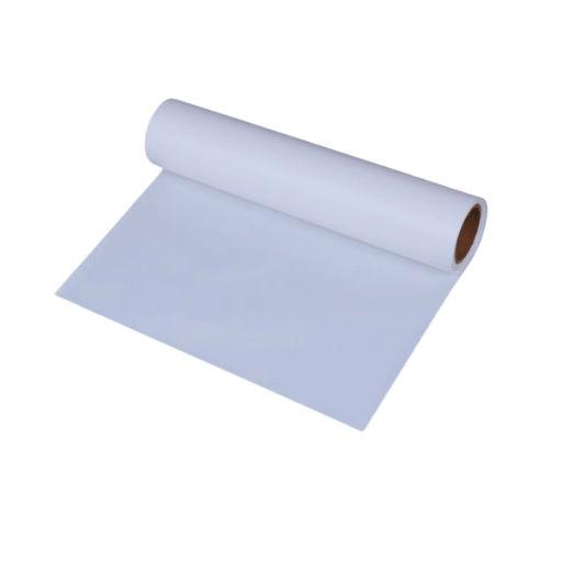
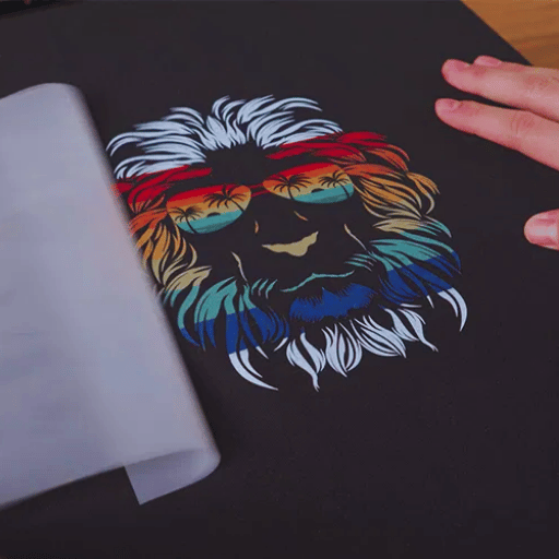
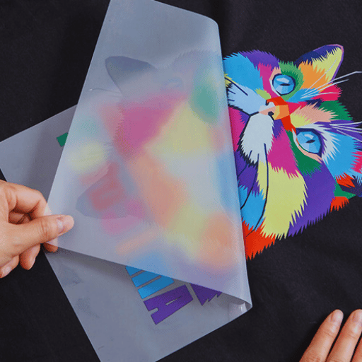
DTF Transfers and Their Impact on Color Output
DTF(Direct-to-Film) can produce significant color output due to the unique nature of the printing method, which applies water-based inks to a film when printing. DTF is unlike DTF variants, such as screen printing, where the resultant color and gamut are not as broad, and several design options cannot be easily deployed. Nevertheless, the quality of the inks, the substrate film used, and the accuracy of the heat transfer are instrumental in attaining some seamless color output. Following the best manufacturer recommendations and choosing high-class consumables will assist in producing colors that are as designed. Regular servicing and calibration are fundamental in reducing color divergence and achieving uniformity in different print runs, increasing the efficiency and acceptability of DTF transfers.
How Can Color Spaces Influence the Outcome of DTF Printing?

Exploring Adobe RGB vs. sRGB for In-Depth Color Gamut
The color management has two unique color spaces, RGB and Adobe, that deviate from one another. Additional colors, such as deep greens and blues, make Adobe a better choice when printing images. Furthermore, it allows photographers to showcase their work because it engages a broader color space that can bring accuracy to reproduction when required. Notably, this option is not used much in web designs since its most optimal use is with printers. It is because many types of printers use their color space shift; therefore, doing so allows security for logos and other design pieces.
Moreover, many industries utilize more common color displays (SRGB), allowing anyone to quickly engage broader audiences using various primary mediums. Essentially, sRGB is much easier to work with than any Adobe RGB color space. The deciding factor on which color space to operate solely relies on the desired outcome regarding the print.
Ensuring Color Accuracy in Your DTF Workflow
Several crucial phases are integral to my DTF printing workflow, the first being high color accuracy. Let’s begin with monitoring calibration, which meets the industry’s standards. This is important because it ensures that an accurate color will be viewed during the project’s design phase. Furthermore, I also enable color profiles for my printer and ink to ensure the digital image files match the corresponding printed files produced without the color management system. Similarly, I make it a point to print certain test prints, altering my setup to achieve vivid, accurate colors. When I constantly put these things in place, I can improve color accuracy, thus making my DTF printing projects more colorful and identical to an envisioned design.
Reference Sources
Top DTF Hot Melt Powder manufacturer in China
Frequently Asked Questions (FAQs)
Q: How can someone make their DTF prints more vibrant?
A: To make your DTF prints more vibrant, apply good DTF color settings—correct CMYK values and adequate white ink density—to prevent washed-out AT prints.
Q: How does understanding color modes affect DTF print brightness and vibrancy?
A: Knowledge of how color modes work, such as CMYK or RGB, in printing technology makes it easier for you to select the correct color, which makes your prints bright and colorful.
Q: Why are DTF color settings necessary for the quality of the final printed product?
A: DTF color settings assist in achieving desired colors and make them appear striking on the DTF prints instead of being muted and inconsistent throughout your designs, thus enhancing print quality.
Q: In what ways do additive color modes determine the range of colors in DTF printing?
A: Additive color modes can increase the gamut volume that your DTF prints can reproduce, enabling more colors to be included in your designs and making the colors more vibrant.
Q: What measures should one consider to ensure DTF prints have consistent color outputs?
A: To avoid this problem, use color management to determine the software’s color settings every time you print DTF and ensure the printer’s color settings are correct.
Q: Regarding DTF prints, how do colors appear because of the white ink density used?
A: This is critical because if the density of the white ink is not correct, then DTF prints might be muted or faded and not have the “punch” look they are supposed to possess.
Q: Which colors does one associate with the DTF color printing procedures?
A: First, one needs to understand that CMYK colors are important in the DTF printing process, as they act as a foundation for many bright colors to be incorporated into the print.
Q: What’s the best way to resolve the problem of ink bleeding or faded prints in the DTF printing process?
A: To resolve the problem of ink bleeding or faded prints, one can saturate the surface with the correct dew point and set the printer’s color parameters correctly.
Q: Why must the appropriate color settings be selected to make the DTF prints colorful?
A: The selection of color settings is critical because it enables you to apply vivid colors to your designs, increasing the effectiveness and aesthetic appeal of your DTF prints.